One of the most exciting parts of starting a new blog is choosing the design elements that make your blog unique to you and your personality.
But often times, it can be a little disorienting figuring out what looks best for your blog. You’ve seen websites that you think look attractive, but you’re not sure how to design your own.
This guide is created to help you make aesthetic decisions about your blog including advice on how to choose the right theme for your blog and how to tweak it to meet your needs. You don’t need to know how to code to achieve a beautiful design. With all of the themes and plugins that Edublogs has to offer, you’re sure to find something that meets your needs.
What is the purpose of your blog?
It might seem a little strange to start with a philosophical question about the nature of your blog as opposed to diving into design elements head-first.
But it’s important to think about the nature of what kinds of information you hope to share with your readers.
Is this a class blog that is designed to showcase different projects that your students work on in class?
Do you hope to gain a global reach and share insights with other teachers from around the world?
Your purpose ultimately will dictate the design elements of your site, so it’s important to think about your audience as you go forth. What might seem cool to a class of third grade students might not look professional to an audience of teachers and administrators, so keep this at the forefront of your mind as we progress through the elements of design.
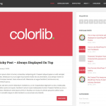
Choosing the best theme for your blog
A few years ago, it might have been the case that it was difficult to find the perfect theme for your blog. But with so many developers working on new themes over the past few years, the real challenge becomes sorting through all of the themes that are available to you.
We’re fortunate here at Edublogs to have a wide selection of themes. At the time of writing this guide, we have 289 themes that you can choose from for your blog. Sue wrote an awesome post showcasing how easy it is to sort our themes by category.
Though we have lots of beautiful themes to choose from, in each section I’ll highlight a few of my favorites.
Responsiveness
More and more school districts are implementing 1:1 device or BYOD policies, and several studies suggest that mobile (phones and tablets) makes up 27% of all web traffic.
When I search for a new theme, I always start by searching for a theme that is responsive for mobile devices.
It’s important that your audience has the same viewing experience on your blog, whether they are on a cell phone, tablet, or computer. By making it more accessible on every device, your users are much more likely to engage with your blog.
Not all responsive themes are created equal. Some look great on a tablet, but not a phone, and it’s important that you have the ability to test out what your website looks like, even if you don’t own every device that your audience does.
Thankfully, sites like mobile.me can help you visualize what your website will look like on different devices. Though I have an Android phone and an iMac, I don’t know what my website looks like on an tablet. This website shows me exactly how my blog looks to a visitor who is on an iPad.
Recommendations for responsive themes
- Hum: A minimalist theme with a soft menu to emphasize your content.
- Responsive: As the name implies, this theme was designed for all of your devices. Want to see it in action? Our Edublogs Help site runs Responsive.
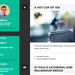
- Writr: A theme with a beautiful splash of color that highlights your author avatar.

White Space
As Web 2.0 tools became increasingly popular for educators, so too did embedding them as widgets in blogs.
In our Edublogs Teacher Challenges, we encourage teachers to experiment with widgets, but it’s important to remember that the more widgets that are added, the clunkier your site will appear.
It all comes down to the purpose of your blog. Do you want your audience to read insightful posts? Do you want an interactive learning environment for your students?
Utilizing white space is common in modern themes. With this minimalist approach, your audience will focus more on the content (your writing) and less on novelty widgets.
Recommendations for themes that utilize white space
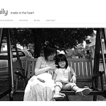
- Family: Simple with a clean background and elegant typography.
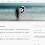
- Highwind: Even flow with header image and sidebar.
- Independent Publisher: Like Writr, this features your author avatar, but with a more minimalist approach.

Emphasis On Text Or Images
Instinctively, most of us know whether we’re image-focused or text-focused bloggers.
That’s not to say there isn’t a fair amount of overlap between the two approaches, but most blog themes are created with one or the other in mind.
Do you plan on showcasing student work in ePortfolios? You might want to consider taking high quality photos and utilizing a theme focused on images.
Do you want students to hone their writing skills and comment on each other’s blogs? You might consider a stripped-down theme that doesn’t distract from the text.
Recommendations for text-oriented themes
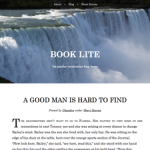
- Book Lite: A beautiful header and crisp black text on white background.
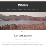
- McKinley: Like Book Lite, but with a larger area for your blog title and navigation menu.
- Mog: An incredibly minimalist theme.
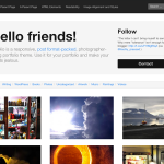
Recommendations for image-oriented themes
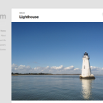
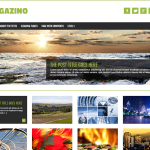
- Magazino: A beautiful slider and featured images showcase your images in style.
- Mixfolio: A portfolio theme with an awesome customizable header.
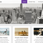
- Noteworthy: An attractive sidebar meshes well with a great feature box to display your latest content.

Color
While it can be tempting to change the background and text colors to match your school’s colors, consider that it is a more effective design choice to use color sparingly.
Using bright colors for your paragraph text or your background can strain your readers’ eyes. Research has shown that participants could read 26% more accurately with dark colored text on a light background.
Focus on themes with white backgrounds, dark text, and a splash of color for important Call-To-Action buttons or hyperlinks. This will help your audience know exactly what you want them to do on your page – read more, get in contact with you, or sign up for an email subscription.
Recommendations for color-designed themes
Hemingway 2014: The search button and hyperlinks add variety to the large header image and white background.
Radiate: Top of the page navigation, magnifying glass, and hyperlink color make this page pop.
Sparkling: Bold use of color and great theme options to customize in the dashboard.

Tweaking Your Theme
Choosing your blog theme is the first big step in designing your site. Many of our Edublogs users are perfectly content with using one of our themes right “out-of-the-box.”
But as you continue your journey in designing a beautiful blog, you’ll soon realize there are little things on your blog you’d like to change.
Maybe you like the way the header image appears on your blog, but the text is difficult to read. Maybe you wish you could change the color-scheme of your blog.
With these easy to implement tweaks, your blog can be customized to look the way you want it to.
Menus

Helping your visitors navigate your content is one of your most important tasks to keep users engaged on your blog.
For those of you that have professional blogs, your visitors are much more likely to leave your website and go in search of information elsewhere if they cannot quickly find what they’re looking for on your blog.
For those of you that blog with students, your students are much more likely to become frustrated and will rely on you to help them navigate where to go on the blog.
By creating a custom menu, you can show your users how to quickly get to the most important content on your site.
I stress with new bloggers the importance of limiting your navigation menu options. Any more than four or five items across your top navigation start to get cumbersome. If you need to add additional layers of information, you can always nest sub-menu options underneath menu options, or add an additional menu to your sidebar with the custom menu widget.
Paragraphs
Information processing is largely influenced by the structure of your paragraphs on the page.
Imagine if you had read this entire blog post so far with out any line breaks, images, or paragraph headings.
Not only would it be boring, but it would be incredibly difficult to read!
Here are some quick tips to help maximize the flow of your information:
Keep ’em short
It’s a matter of personal preference, but if you follow many bloggers, you’ll notice that the trend is to type ultra-short paragraphs.
Each complete idea often receives its own line. If you scan quickly through this post, you’ll notice that most of my paragraphs contain only one or two sentences.
I’m proud to say I didn’t fail English in high school; while I utilize traditional paragraphs in formal papers that I write, it’s easier to quickly scan ideas when they’re broken up by line breaks.
Use subheads
Ever notice that drop-down menu in your post editor that lists Paragraph as the default choice?
If you click to open the menu, you’ll notice that you have several heading options (H1-H6). Think of this as a way to outline your text with your main points followed by supporting points.
Right now I have the blog title set as Heading 1, “Tweaking Your Theme” set as Heading 2, “Menus” set as Heading 3, and “Use subheads” set as Heading 4.
Utilizing this structure makes the content easier to read and is super helpful in crafting the perfect blog post before ever writing in the supporting paragraph text.
Include relevant links
Adding useful links in your paragraphs is an easy way to keep your visitors on your site longer and share additional useful information.
Additionally, since hyperlinks are usually styled in a different color, they provide a focal point when people scan your text.
Typography
Font size
As user experience advocates continue to shape the future of web design, many bloggers are starting to gravitate towards larger font sizes.
On The Edublogger, we use a font size of 18px to make our articles easier to read.
Ultimately, larger font sizes result in additional scrolling, but that’s often a small price to pay for accessible content.
Supreme Google Webfonts Plugin
 By enabling the Supreme Google Webfonts plugin, you’ll have access to a variety of fonts and sizes for any of your post and page text.
A word of warning: don’t go too crazy with a variety of fonts. Like colors, simplicity is often best; reserving a unique font for your headings or subheadings.
Designers are intense about their typography, but you should be able to succeed by focusing on simplicity and readability.
CSS
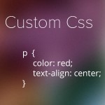 If you’ve implemented all of these tips and you’re still craving more, having a working knowledge of CSS will help you make any additional changes you want to your theme.
Even if you’ve never learned code before, there are great learning resources at your disposal – for text-based, check out HTML Dog and for awesome interactive tutorials, check out Codecademy.
By enabling our Custom CSS plugin, you’ll be able to edit your theme in no time!
Try it out!
All of the themes and plugins mentioned in this article are available to Edublogs Pro and CampusPress users (and many of them to free members, too). Let us know what you think and any of your design preferences in the comments below!
If anythng on line feels like a community it’s not necessarily due to who is making the remarks, but the remarks themselves – that’s what you’re connecting with.
I’m not on Twitter that much at all – I don’t enjoy it. I’m now looking to find out how to design a blog & am finding this process overwhelming. Any suggestions for calming down and info about the process of designing a blog?
If design feels overwhelming, don’t sweat it 🙂
Most of these tips are to help one make their site look even better than it already does. If you’re just getting started with your blog, I’d recommend keeping it simple and choosing a theme that looks attractive to you. It’s super easy to change the theme later on, so go with your gut instinct now, and make changes as you go along.
Thank you Dan! I am excited to submit my blog Climate Talk to my instructor. I am learning a lot from you and Edublogs!
I’m glad to hear it, Susie! Your blog is off to a great start!
Choose what best defines your blog: your ideas, thoughts and driven philosophies. I think designing is not about choosing the best and expensive. Rather it is about making the best and quality. This can be best ensured with white space ( more the white space, more quality is will have) and clarity in mind and expression. Thanks for sharing such a wonderful post. Glad reading 🙂
Regards:
Barbara
byteme.cc
Thanks for the tips!